Upgrading The Knot’s wedding website editor

About this project
Timeline
2023 - 2024
Contributors
Karishma Kapur, Senior Product Manager
Christine Choi, Senior UX Writer
Rob Isaac, Engineering Manager
Angel Esquembre, Senior Data Analyst
Michelle DiBartolo, UX Research Manager
Kalyn Conley, Senior Product Marketing Manager
Amongst the Guest team’s responsibilities is the feature that couples most often know and discover The Knot through, free Wedding Websites.
As the lead product designer on this team, I’ve been heading up the charge to improve this feature. I’m working closely with my PM and Engineering partners using a data driven, user centric approach to overhaul the experience.

Changing your design within the editor shows you how each design would look with the content you’ve added
Project TLDR
When our team worked on this feature in 2022-2023, what caught my attention was that many features we lacked had become absolutely standard in the industry. I created a comprehensive deck to gain consensus on the need for investment, including a deep dive on the data, details on since forgotten past initiatives, a competitor audit and more.
In Q1 of 2024, we’ll work on a major reshaping to the website editor with an eye towards continued iteration for a beautiful, modernized north star.
Gaining consensus
Making the case for a genuine investment into
wedding websites wasn’t simple. Data points like “79% publish rate” and “67%
said the site is easy to set up” seemed to confirm the success of the
feature, but lacked context for the greater story.
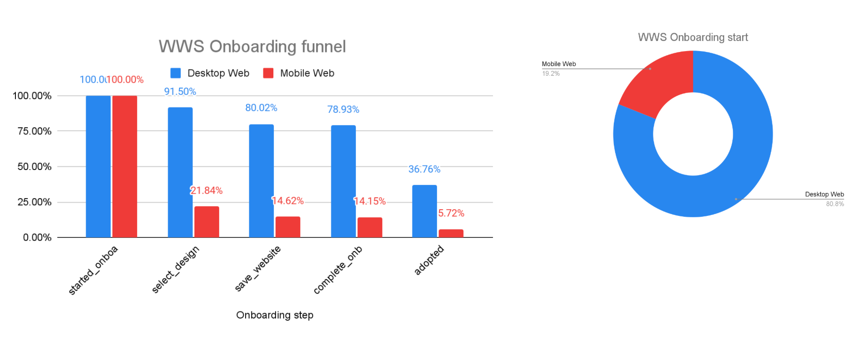
Dropoff from setup to adoption had gone unaddressed for years
One of our primary measurements of feature quality has been the annual
satisfaction survey, which targets couples who have received 30+ visitors to
their site. Meaning we’ve effectively only talked to users who have already
chosen TK, and we know little about those who had abandoned their sites.
Even within this largely satisfied survey cohort, a user had this negative
feedback:
“I realized later that Zola had much better editing options. My website
looks immature.”
Although TK’s market share in the website space has remained hovering
around 50%, Zola has gained 9% in the last two years. Looking closer at our
competitors, we saw many features that we lacked had become standard:
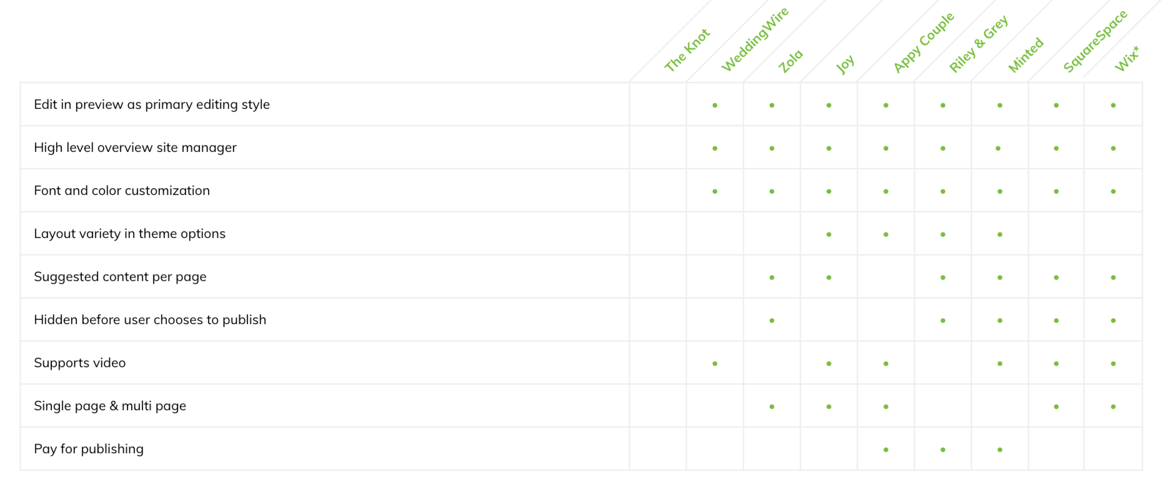
Couples have many options to choose from when it comes to wedding websites
Past experiments
Amongst mergers and staff turnover, not many recall all of the specifics
around the two big tests that failed on WWS in the last few years, but
these expensive missteps kept coming up. I spoke to veterans on the team
who recalled the broad strokes and helped me dig up the artifacts to
include in my deck. This was a crucial element in gaining alignment for
strategies in 2024.
Learning more about these past experiments also helped our team gain a
greater understanding of how the wedding website feature works, makes
money and how it has evolved.

An "Oprah" expirement visual from 2019
Failed “Lite site” experiment visual from 2021
Overhaul to the editor
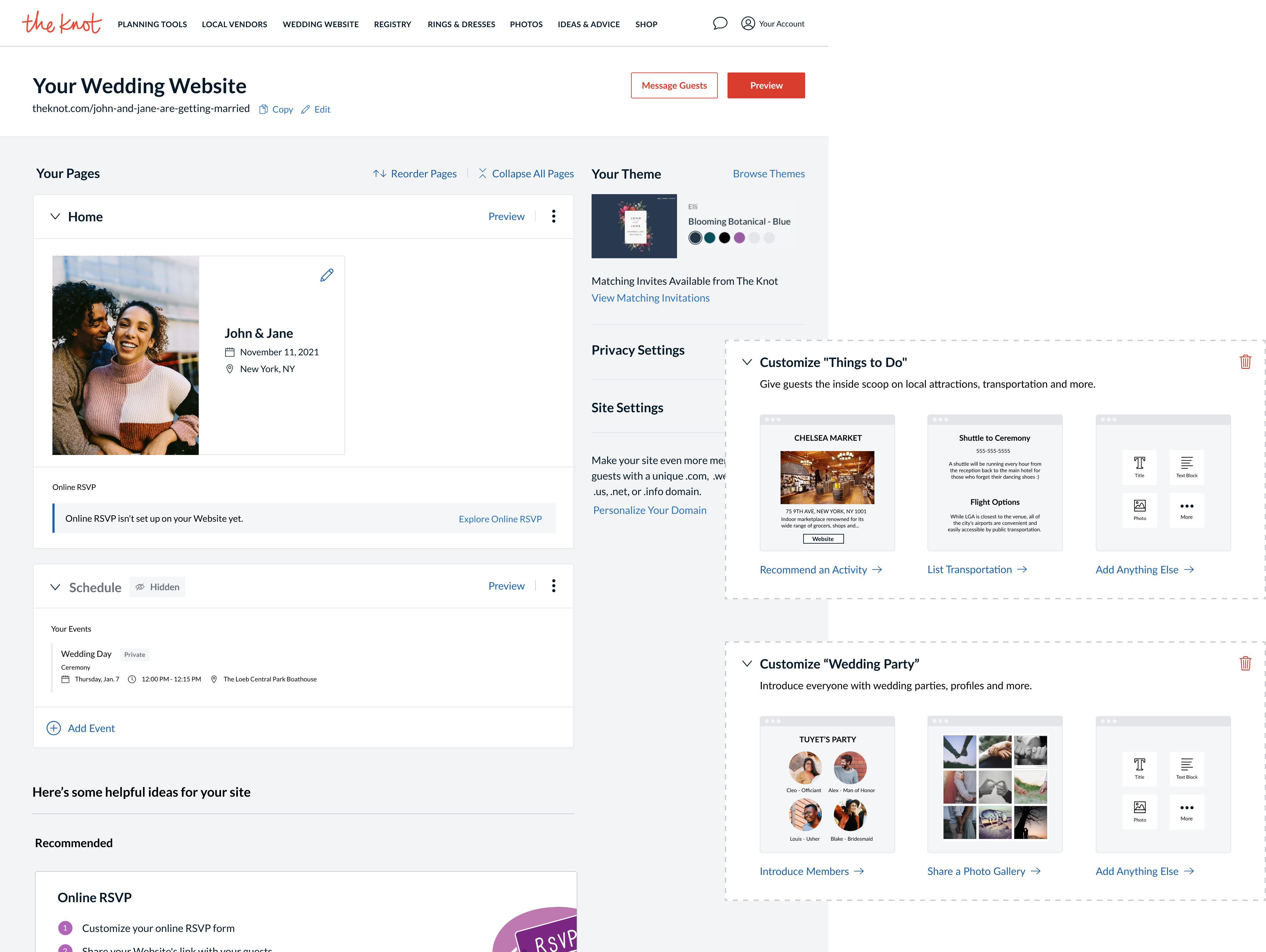
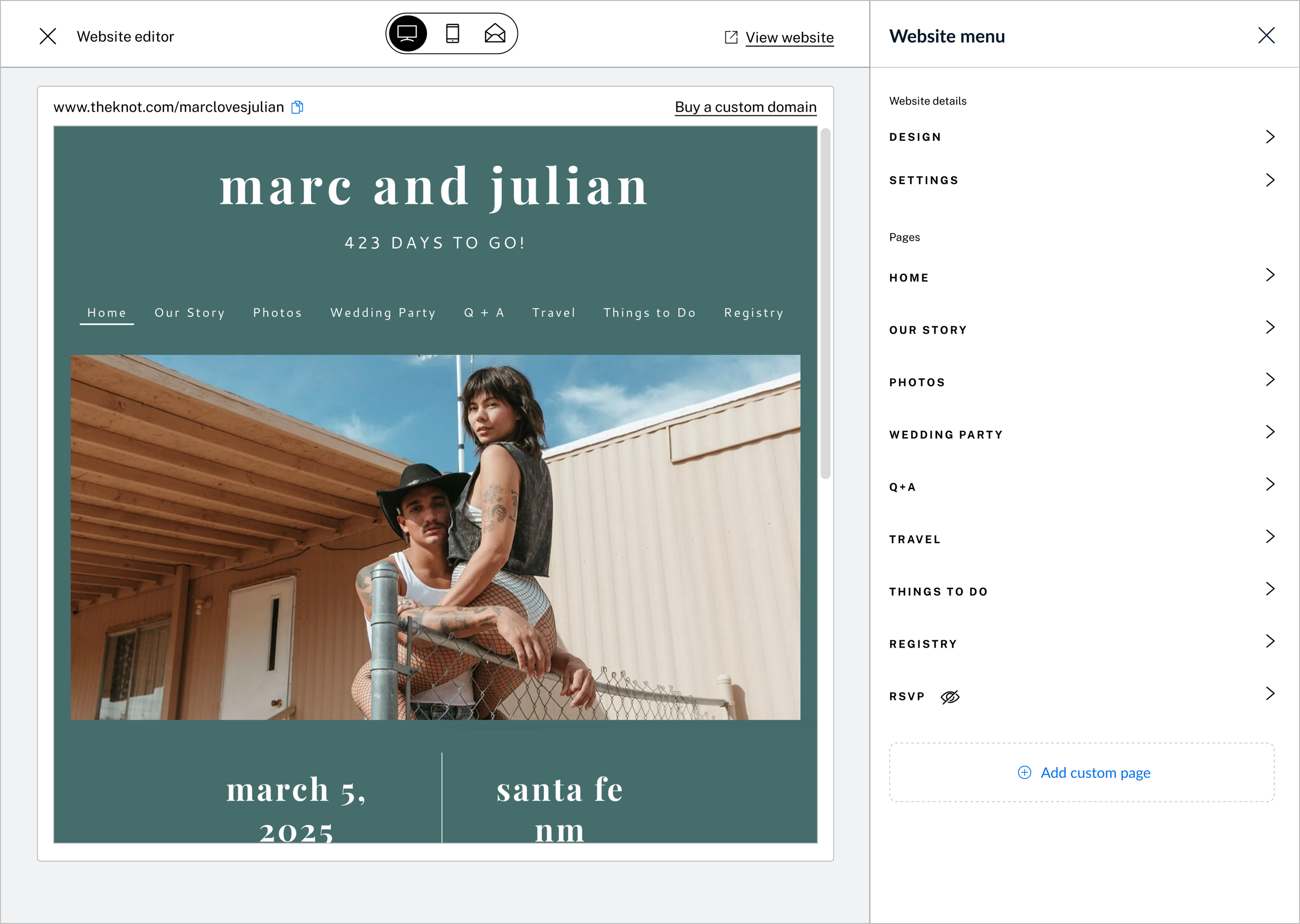
The most crucial element to upgrade was clearly the editor, which currently defaults users to a form style layout without the benefit of a preview window. Based on our audit, we know that the edit in preview style is easier to use and industry standard. We do have the ability to edit in preview, but it is hidden and lacks core functionality. Still, the data showed that users who engaged the preview state were 2.1 times more likely to adopt, indicating the potential for greater success. I began auditing the existing experience on desktop web and mocking up wireframes to think through what we could accomplish in Q1.
The existing editor appears more like a form, and it’s unclear how content will display on the site
Its not immediately clear where to find edit in preview, and crucial functionality is missing
Crucial UX questions came to the forefront:
How should users navigate to the new and improved edit in preview?
Should this new experience completely replace the existing manager?
Can we incorporate our design systems & patterns to the editor without compromising the experience?
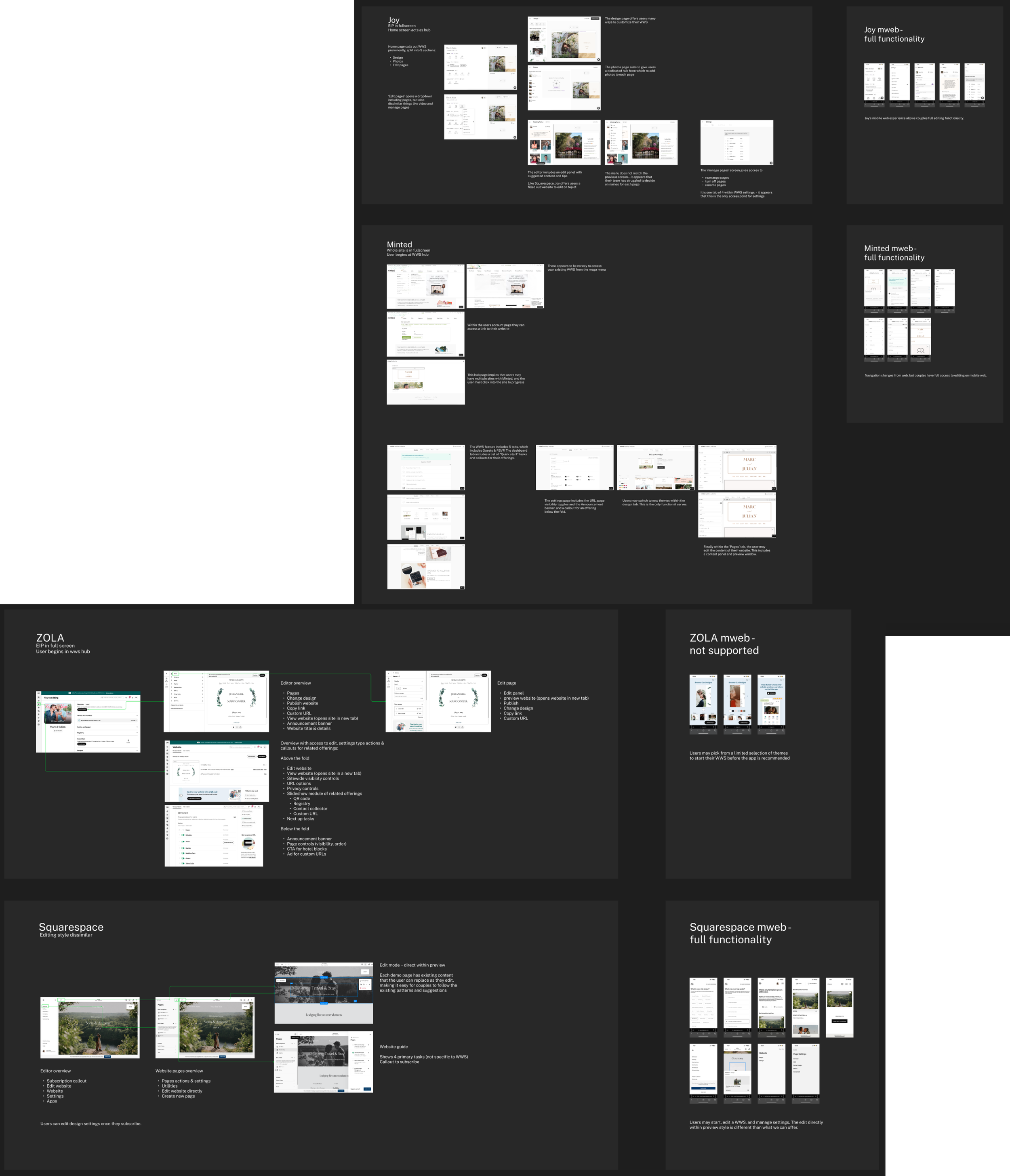
A competitive audit including wedding industry competitors and web giant Squarespace
I did some research and began thinking through our needs from a zoomed out view by iterating on wireframes for a north star vision. Although we’d need to maintain a smaller scope for Q1, working out what we’d want to build towards laid a crucial foundation. From there, I put together designs for Q1, working closely with my engineering partners to ensure the scope would fit in our busy roadmap.


We kept the scope lower by utilizing screens and functionality that we have today, knowing we’ll iterate