Wedding websites on The Knot
About this project
Timeline
Multiple quarters, 2022 - 2023
Contributors
Karishma Kapur, Senior Product Manager
Dave Jules, Senior Product Manager
Camilla Cusani-Visconti, Product Manager
Christine Choi, Senior UX Writer
Rob Isaac, Engineering Manager
Adam Lior, Engineering Manager
Angel Esquembre, Senior Data Analyst
Sarah Selph, Senior UX Researcher
Michelle DiBartolo, UX Research Manager
Kalyn Conley, Senior Product Marketing Manager
The Guest team is responsible for guest communications tools, including the feature that couples most often discover us through & come to us for - wedding websites.
As the lead product designer on this team, I’ve been heading up the charge to improve this feature. I’m working closely with my PM and Engineering partners using a data driven, user centric approach.

Project TLDR
In Q4 2022, the Planning & Guest zone had a shared OKR: increase traffic & completion of the wedding website setup flow. Our team improved completion by 4% on mobile web and 18% on iOS. We also added filters, a highly user requested feature, and missing iOS functionality.
Setup flow completion only measures an early moment in the user journey, and whether couples ultimately share their site is the more important metric (adoption). After this work wrapped, I created a research initiative to dig deeper and share my findings across the org.
Design Process
I began by auditing the existing experience on TK’s wedding websites, and
the competitor landscape. Although our competitors offered more robust and
modern visuals, we knew we couldn’t accomplish that type of update in the
one quarter that was allotted. Instead, we set our sights on practical
improvements.

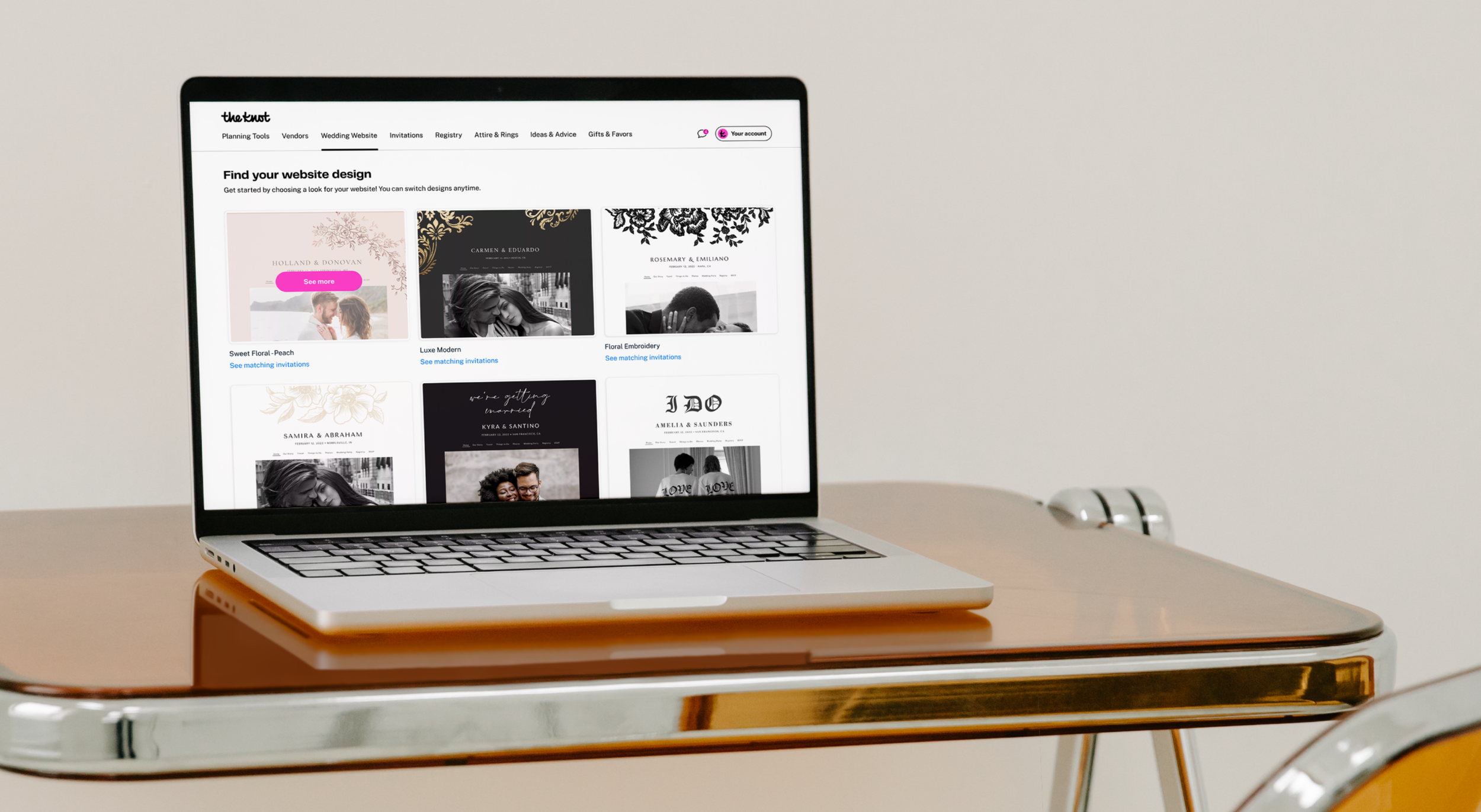
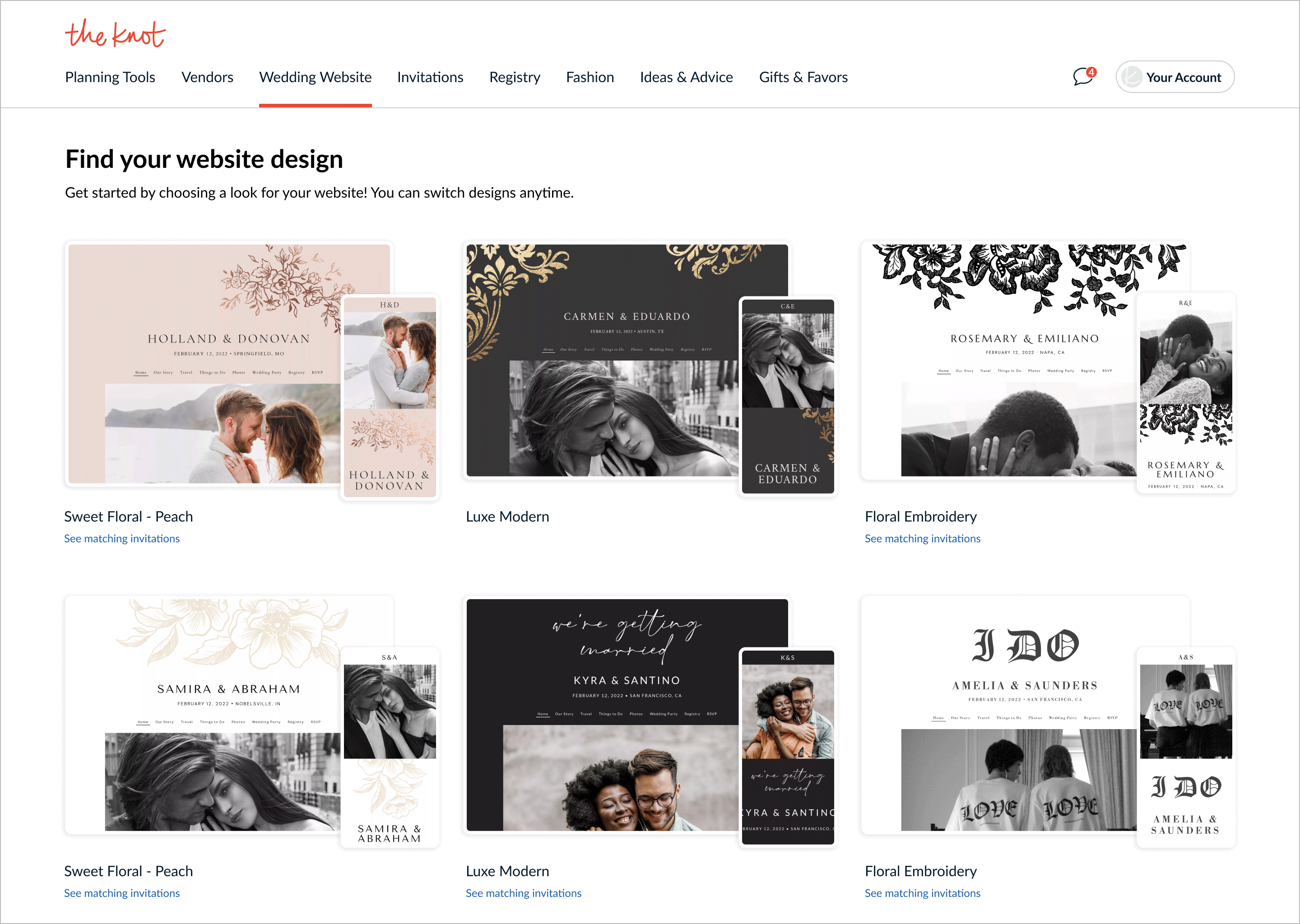
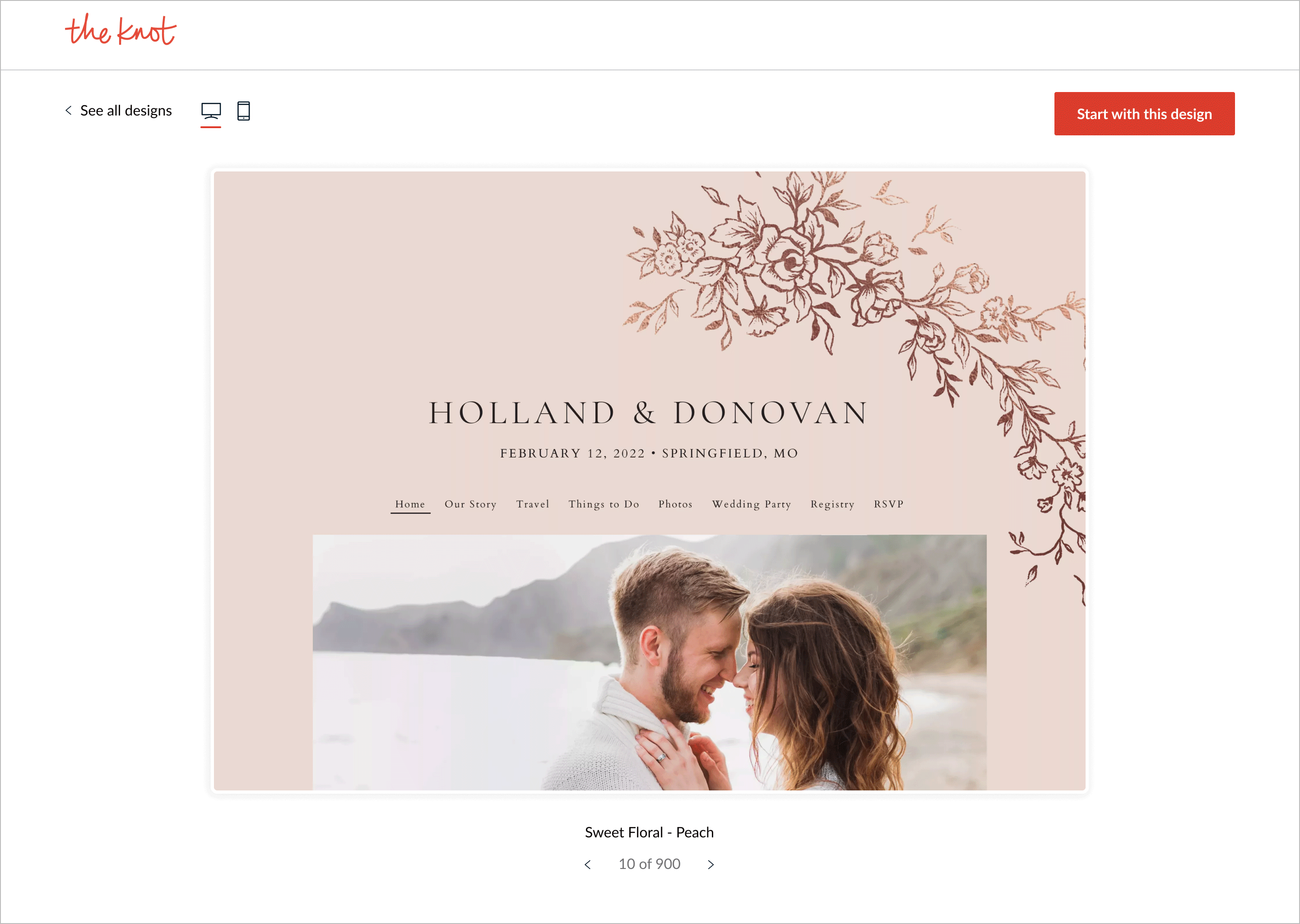
Screenshots of the existing experience on TK, across platforms

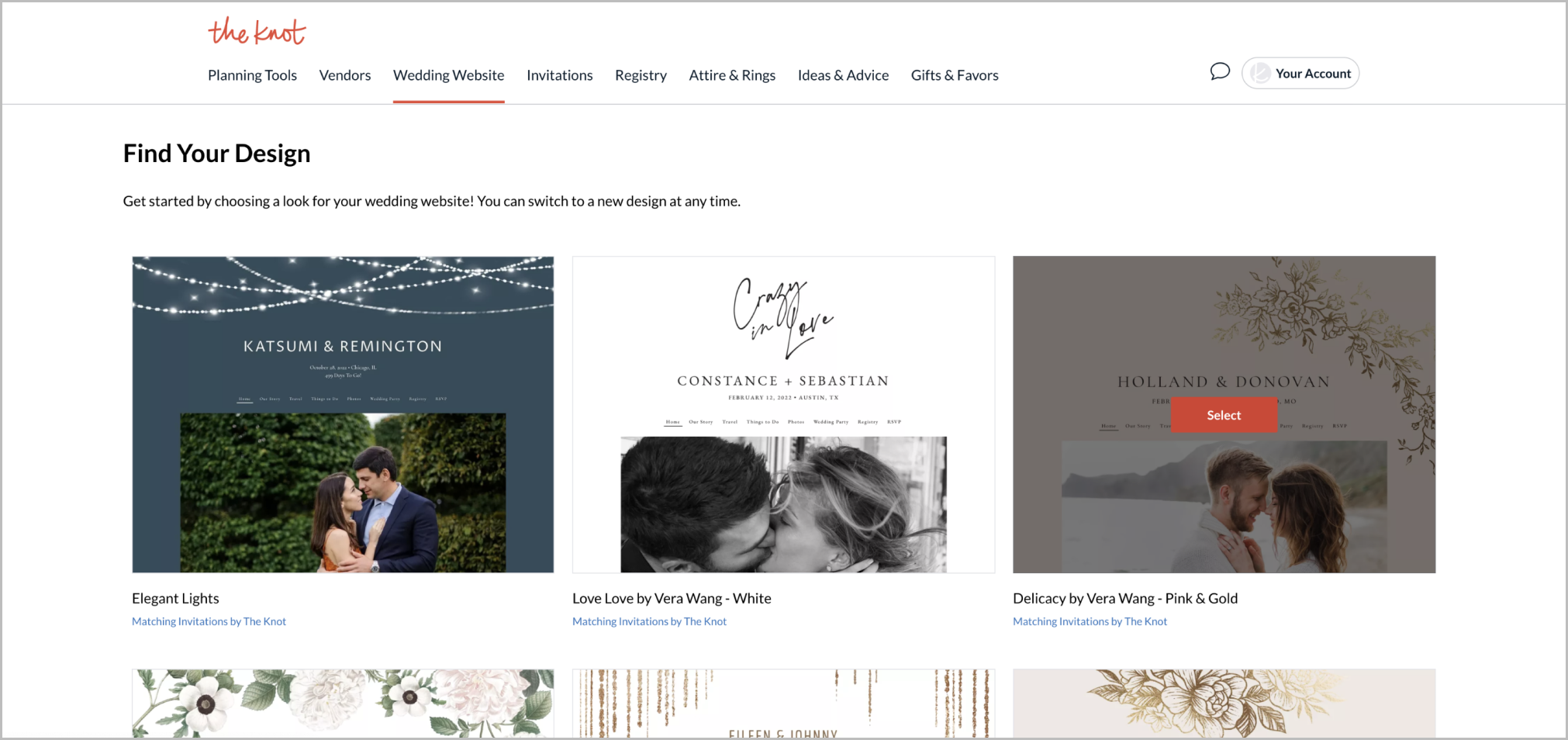
Screenshots of Wix

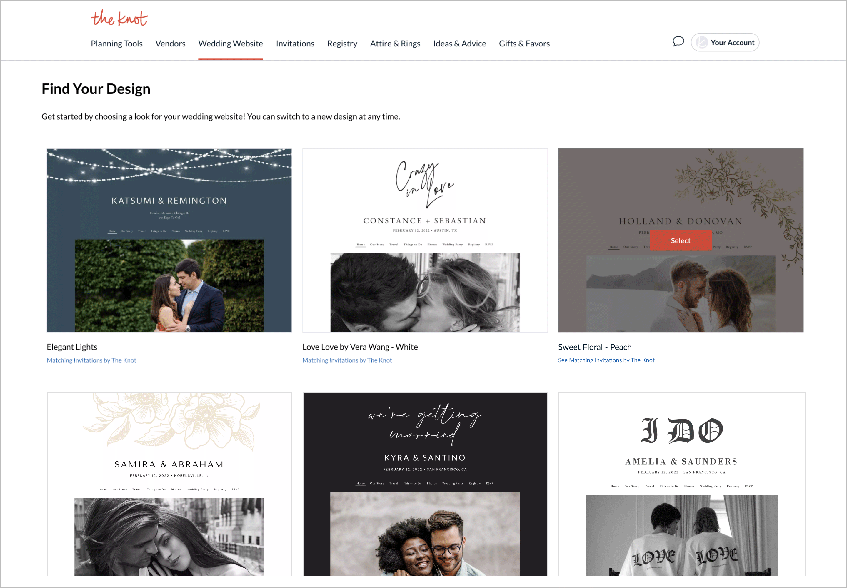
Screenshots of Zola, with a comparable preview flow to Squarespace
User research
Coming into the quarter with the zone wide initiative to increase traffic to wedding websites, we ran user testing on the existing experience to understand more about user expectations and sentiments.

Screenshots from the existing setup flow on TK
Learning objective
Assess whether users find the WWS creation flow and select editing tools quick and easy.
Assess what additional features users may expect.
Assumptions
- Filtering themes has become industry standard functionality and users are likely to notice we don’t have it.
- Most of our competitors offer very robust preview experiences, including fully functional and attractive example sites, making our offering look dated in comparison.
What we tested
The WWS setup process, preview mode & changing the theme after setup
Methodology
Unmoderated User Testing
Unprompted, more than half of the users conveyed that they wished filters were available to narrow down their search. Both style and color filters were mentioned consistently. One user conveyed that they were looking for orange themes specifically, to fit their autumn wedding.
Our team advocated to add filters against a lot of pushback. Publishing our research article to the organization’s UXR platform helped to communicate across teams and gain alignment.
Outcomes
Our team was able to make a number of impactful updates across platforms,
including filters, adding missing iOS functionality, quality improvements
and more.
Tweaks to the styling of the theme grid help to improve overall quality
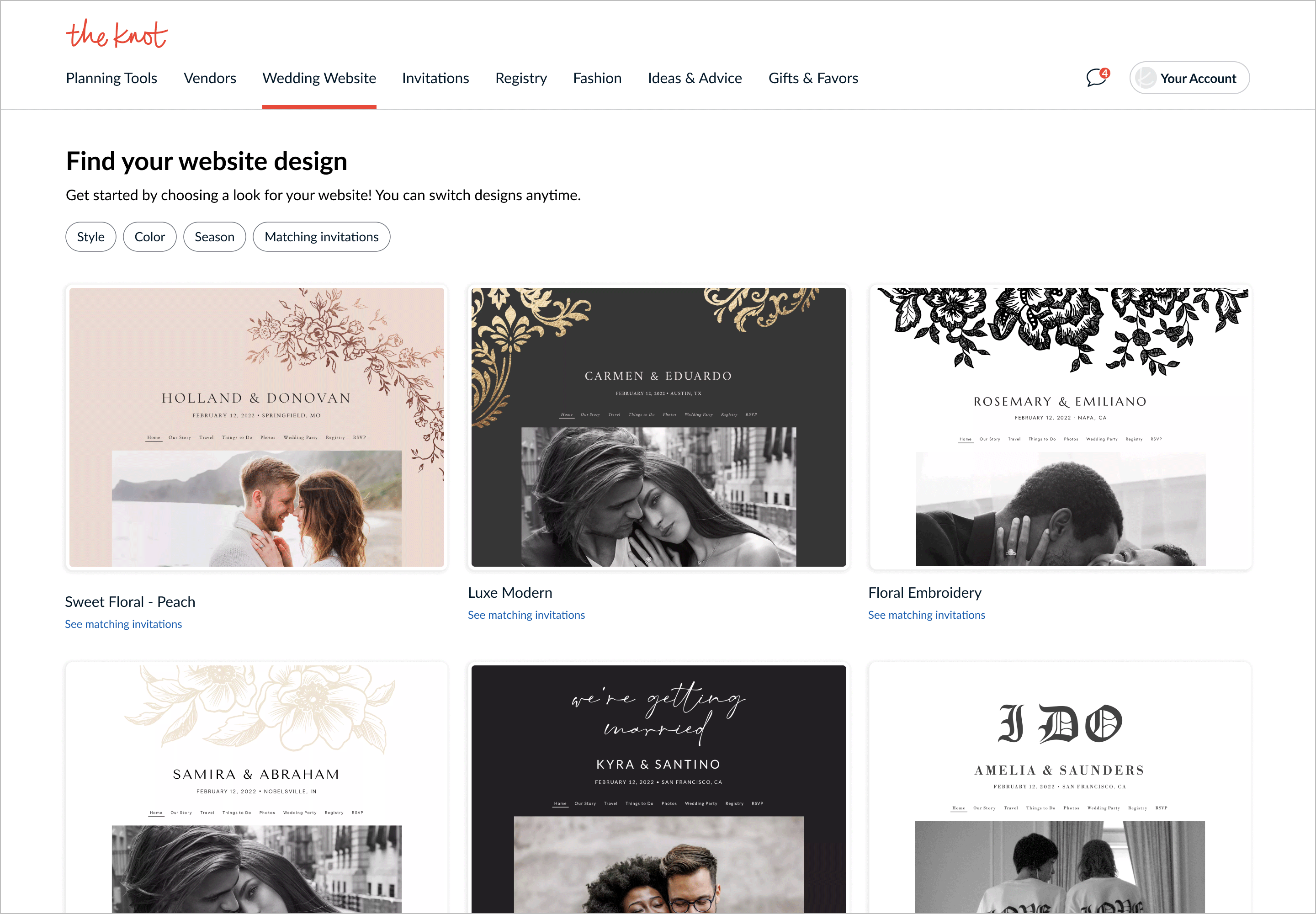
Filters have been highly requested for years
We tested a version with mobile that failed
Here users could scroll within the frame to see more of the design, but this test also failed
We were able to make great improvements to desktop, mobile web and iOS. The two most impactful updates we made were on mobile web and iOS, improving conversion by 4% and 18% respectively.
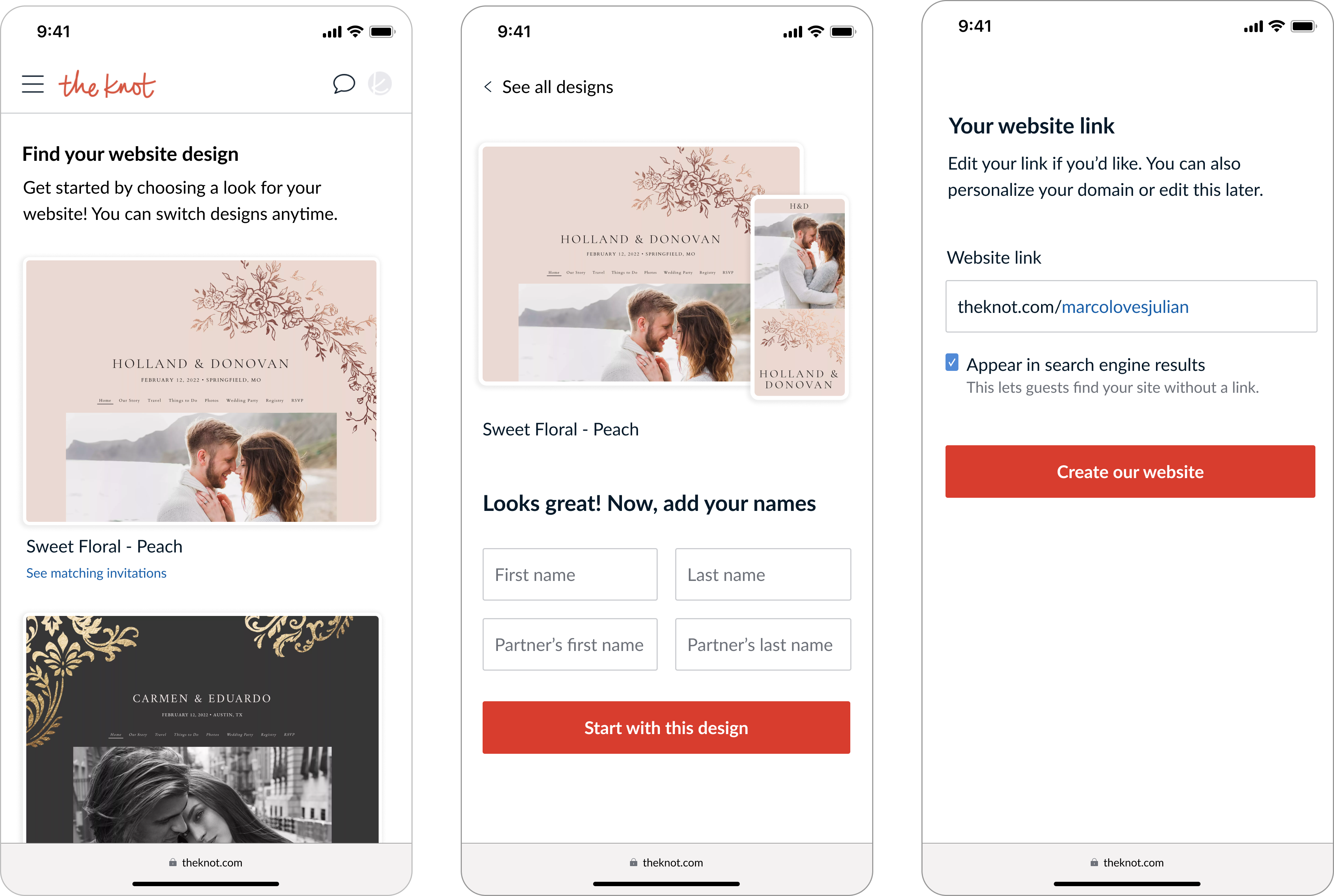
Step 2 on mobile web had been missing a view of the design, leading to substantial dropoff
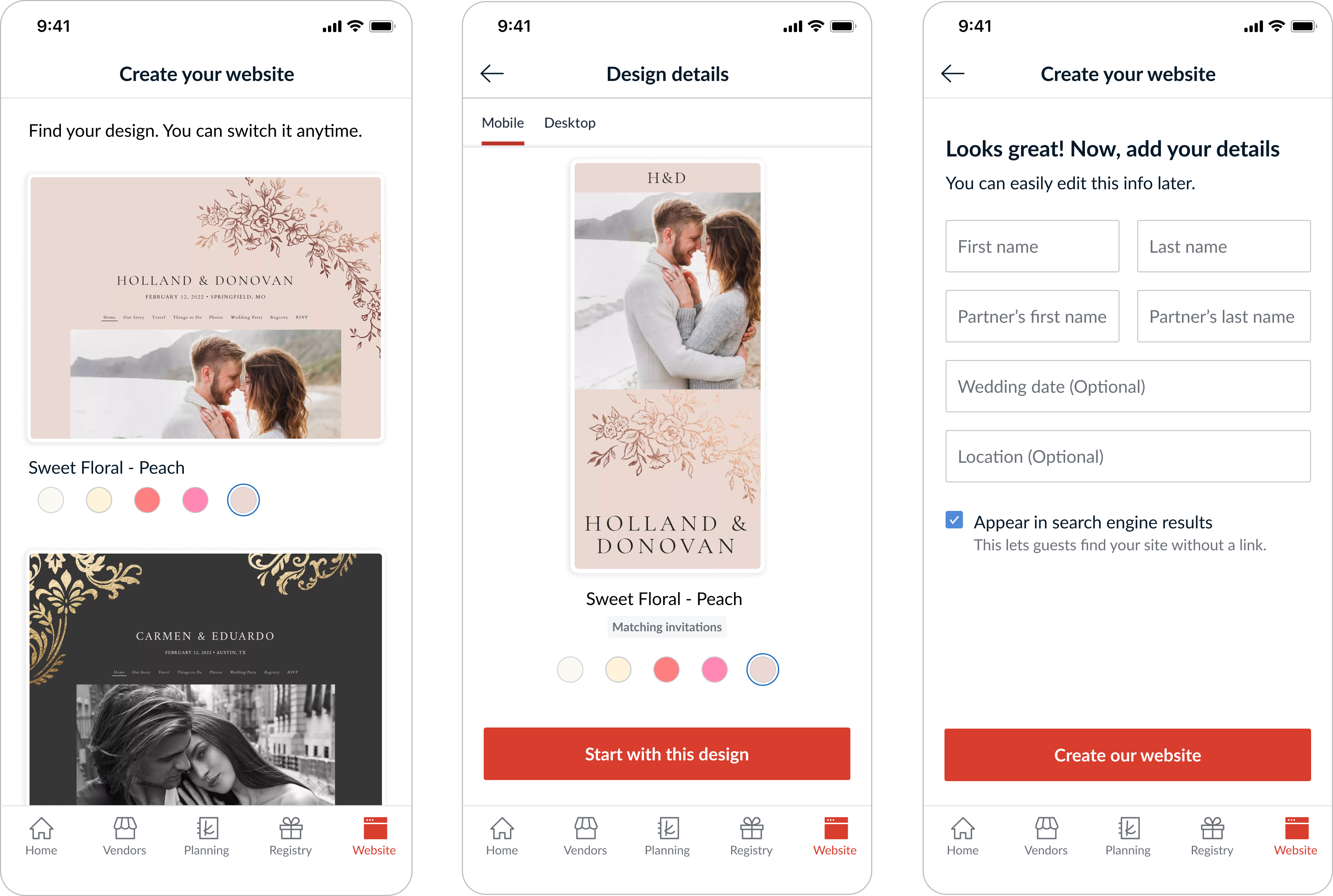
Changes to iOS drastically improved the styling and proportion of design thumbnails
Next steps
It was clear that there was more valuable work to be done around this feature, and to that end I led a deeper investigation. Although it is a free tool, the importance of this feature cannot be understated:
Wedding websites are the #1 reason that couples come to The Knot.
About half of couples know The Knot from visiting a loved one’s wedding website.